Redesigning Happiness At A Click Of A Button — McDelivery UX/UI Proposal
Redesigning your happy & cheerful McDonald’s experience

Introduction
The Team
The redesigning of the McDelivery Singapore app was the capstone project of my team member, Chik Jun Xiong, and I, Farah Iskandar, under Nanyang Technological University’s User Experience & Product Management (UXPM) course.

Role & Approach
Our role as UX / UI designer was to conduct a research on the current McDelivery app through the use of various research methodologies. Throughout the six-month long course, the following was conducted:
- Competitive Analysis
- Contextual Inquiry, User Interviews & Survey and Analysis
- Affinity Mapping
- Heuristic Evaluations
- Personas & Customer Journey Mapping
- Sketching & Storyboarding
- Wireframes
- Usability Testing
- Style Guide
- Prototypes
- Mock-Ups
McDelivery
McDelivery was first introduced in Singapore in 2005. It serves as an extended service of McDonald’s to deliver food to the customer’s door. McDelivery has been an absolute success in Singapore. According to the 2019 Global McDelivery Records, Singapore holds the third position for the most number of McDonald’s deliveries in a day!
The Challenge
While McDonald’s is highly sought after as the ultimate fast-food in Singapore, the app however, has met with negative reviews by users.
The McDelivery app Singapore, is the #3 most downloaded ‘Food & Drink’ app on the iOS and has a rating of 1.9 / 5 stars across 1.1K ratings.On the Android version, the app has a rating of 2.9 / 5 stars across 5.4K ratings.
While it is a popular app on both the iOS & Android, the ratings received on the app is significantly below average.
Therefore, there is a need to understand the frustration that users faced while using the app. Hence, this UX Research Project was carried out to figure out a solution, in order for the app to perform better and meet the expectations of users.
While McDonalds is a universally recognised brand, its main objective is to provide consistent customer experience and this should be extended to every aspect of the business, thus, including the McDelivery app itself.
So, what went wrong?

By going through the ratings and review of the app on both Google Play and the Apple App Store, the most common feedback left by users are;
- Users are unable to edit their address despite having a dedicated page
- There are no real time updates on delivery
- There is no page for users to leave feedback or report issues should it arise — no chat-box to connect to customer service to seek help
- There is no option to communicate with rider — no chat-box
Comparative Analysis
We compared the McDelivery app against the top food delivery apps available in Singapore and find out which features within those apps works well with users. We gained further insights and understood what McDelivery app users might want and how the app itself could improve the whole McDonald’s experience.
FoodPanda & Grab Food
While FoodPanda and Grab Food does not solely serve one restaurant, it was important to compare to these apps as it is currently the leading food delivery app in Singapore. On top of that, both FoodPanda and Grab Food are also platforms McDonald’s engaged to deliver its food.
From our analysis, it was evident that the competitors’ use of live GPS tracking of riders, the readily available customer service support, the ability to connect with delivery riders directly and the easily editable address page are features that allowed for a better user experience. Hence, these are the features that we were able to take into consideration for our design concepts.

Understanding Our Users
Contextual Inquiry & User Interviews

A set of screener questionnaire was handed out and six candidates were shortlisted for a contextual inquiry and user interview.

The above participants were tasked to complete an order while we observed, From the observations, we recorded the following:

Following that, we conducted a user interview to gather more insights. We asked the participants the following questions:
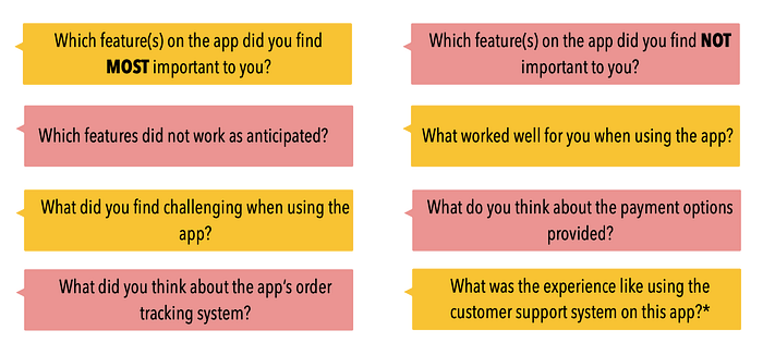
We were able to learn that while it is a relatively easy app to use, such as the app having a simple navigation, there are numerous issues as well. The issues are as follows:
- Incorrect address was auto-filled upon keying in the postal code and it is uneditable and inaccurate
- Price of customisation not clearly stated
- The tracking of delivery is poor as it is inaccurate & unpredictable
- There is no platform to report issues
- A clear visual menu is an important feature and the favourites icon is not an important feature
- One user was unable to complete the task and found that the support system within the app was almost non-existent
Survey & Questionnaire Analysis

General insights from active users of the app that corresponds with user feedback findings, contextual inquiry & user interview:
- Tracking of delivery was rated the ‘most important’ on the app but it performed badly
- Auto-filled address was also rated poorly

Design Process
We started out by asking the most basic question —
How do we translate the McDonald’s experience customers receive in-store, through the McDelivery app?
Being at the comfort of your own home, or anywhere for the matter, and ordering yourself McDonald’s is a completely different experience from ordering in-store. There are endless possibilities of what could go wrong, from realising that you have received the wrong order only when the food arrives and there was no easy way to seek help to your order not arriving because you’ve keyed in the wrong address after you have placed an order and there was no efficient way to undo that.
Therefore, our primary undertaking was to rethink of a way to improve existing app functions and include better systems in place to deal with problems that may arise.
Affinity Diagram
The use of affinity diagram made it more efficient for us to categorise the problems, base on the feedback that we have gathered from the various research methods.

Based on feedbacks by users, the major issues that the McDelivery app faces are under;
- Tracking of delivery — system of tracking is outdate and unreliable for its accuracy
- Overall look & feel of the app — app looks outdated and prices of items are not clearly stated with a high reliance on text over images
- Delivery rider — users have no way of contacting the riders
- Overall navigation — while the app is relatively straightforward, there are major issues, such as uneditable address, that makes the user experience frustrating
- Functions — users find the functions on the app to do as it states
So, Why Is there A Need To Redesign?
While the app does what it was set out to do, we are more concerned with the overall user experience. No app is perfect and it is a continuous effort to consistently improve. While majority of the functions on the app is performing its task, there is a general consensus among users that it is an outdated app. There is also a heavy reliance of text on the app and in some instances, items are not labelled, such as a change of drink. While these may seem minor, it affects the overall user experience of the app. We saw a need to change this and translate the amazing user experience McDonald’s customers receive in-stores through the app.

User Personas

We created two different personas:
- Shanti Prem, 23 (Primary Persona)
Problem:
- Keyed in the wrong address for delivery
- Had a hard time finding a way to get help — eventually found a hotline number but had to go through a tedious process & did not get a follow-up call to confirm the problem was rectified
How do we solve this problem from arising in the first place and how do we redesign the app in a way that ensures Shanti is able to receive help immediately without having to go through so many channels?
2. Maxwell Heng, 30 (Secondary Persona)
Problem:
- Ordered McDelivery while he was on the way home
- Could not track the delivery as the app does not support the function
- Delivery rider arrived earlier than anticipated & Maxwell was not home yet
What could the McDelivery app have done to ensure that Maxwell did not have ended up in this situation? Could just having a more accurate time of delivery be enough to rectify the problem?
Customer Journey Map
Using Shanti’s user experience as our persona, we translated this into a customer journey map (CJM). By using the CJM, we are able to translate not only the experience but rather the emotions Shanti conveys while she went through her experience with the McDelivery app.
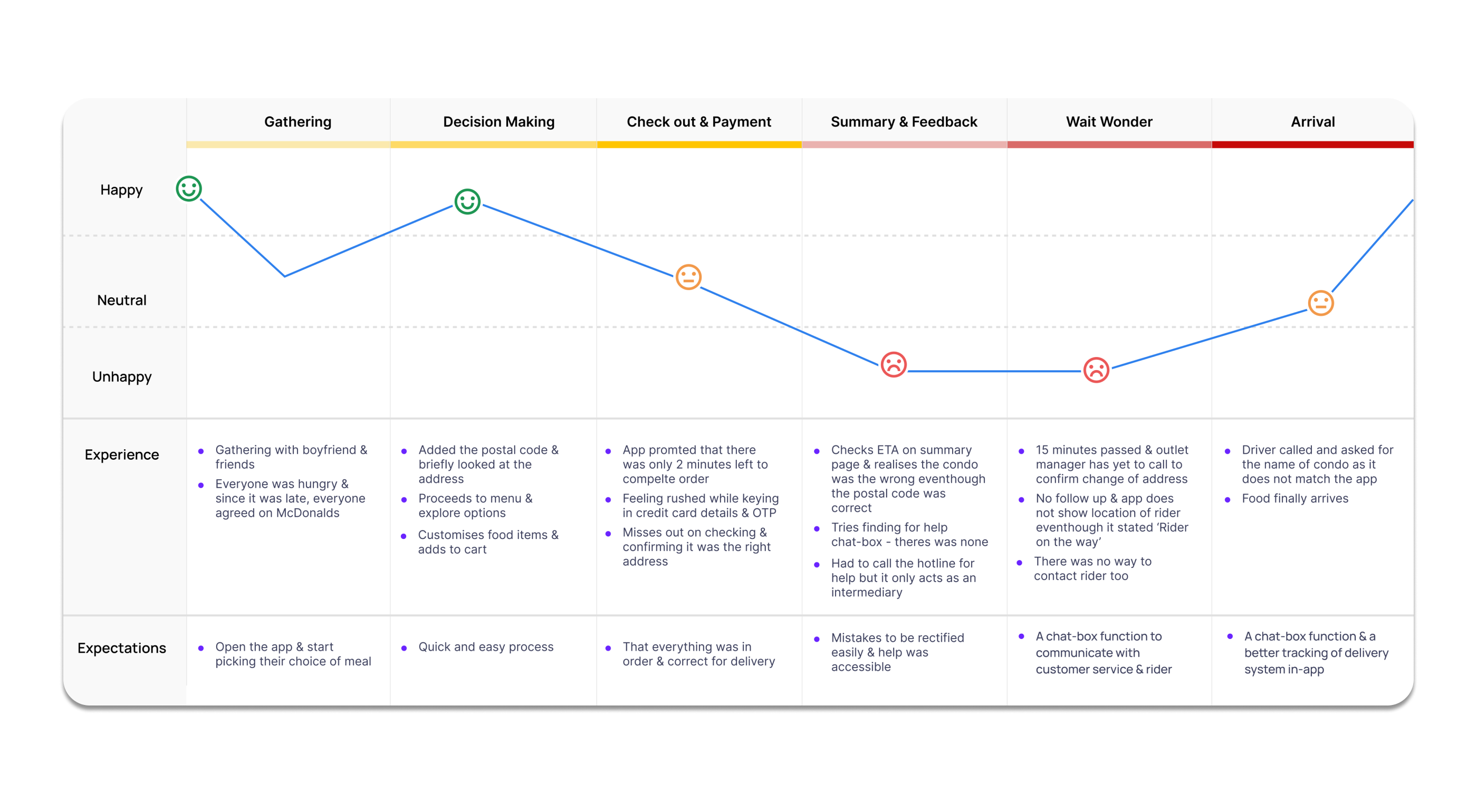
Through the CJM we were able to see that the overall McDonald’s experience for Shanti did not went well. In this instance, the ‘Happy & Cheerful Experience’ was met short on expectations due to the hassle Shanti went through.
How are we going to fix this?
Value Proposition
Taking into account of everything, we came up with the value proposition;

The thought process behind the redesign of the app is;
Convenience — where the address is easily editable, menu well labelled, tracking of delivery is intuitive and reliable and users can easily get help. Fixing all these will bring about the McDonald’s happiness to the users.
Wherever & Whenever — the 24-hour McDelivery service provided by McDonald’s
At A Click Of A Button — implies that everything is now accessible within the app, from getting the help of customer service to connecting with the rider.
User Flow
Using the scenario of Shanti, the primary persona, we came up with a new user flow that fixes her problem.

As the scenario states, Shanti had already placed an order with the incorrectly filled address. Hence, we decided that the right way forward was to create a new function within the app — ‘Contact Us Page’
- Preparation stage — Shanti is able to connect with customer service via the chat-box function.
- Delivery stage — Shanti is able to connect with the rider directly. She will not only be limited to a chat-box but she will also be able to call the rider directly.

We believe a ‘Contact Us’ function would improve the user experience as help is not only easily accessible but convenient as the chat function is straight-forward & reduces the time taken for her to search for the hotline number and wait for a customer service representative and outlet manager to respond to her.
Redesign — Introducing The New McDelivery App


The thought process behind the redesign of the McDelivery app was in the project goal itself.
I wanted to express happiness through the images as an extension of creating your own happiness with your McDonald’s meal
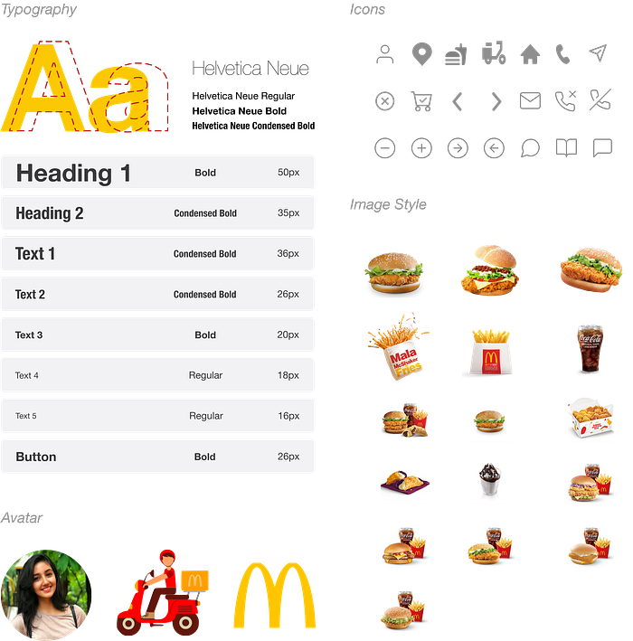
Style Guide
The colour palette for this app incorporates the main colours used in the McDonalds branding such as the ‘McDonald’s Yellow’ & the ‘McDonald’s Red’. To balance out the overall look & feel of the app, base colours such as ‘Off White’, ‘Off Black’ and ‘Grey’ was used.

Solutions
To address the problems of the app, the following solutions are proposed:
- Edit Address
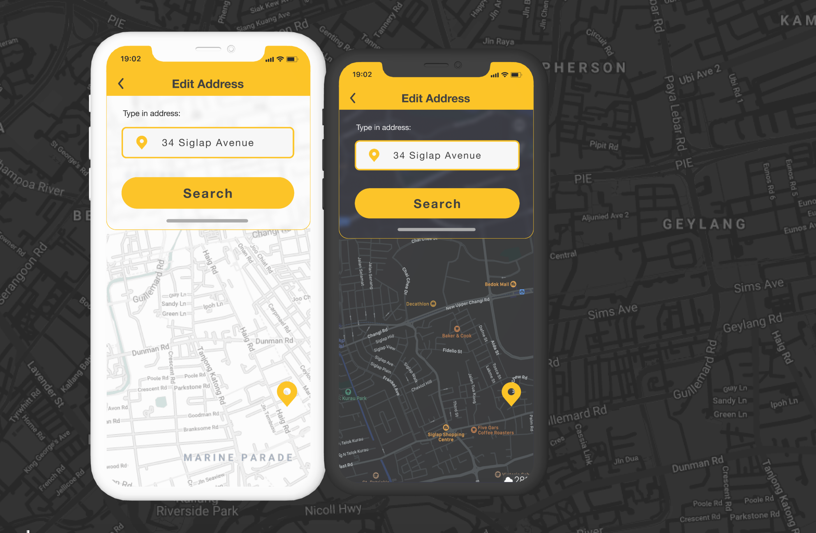
Initially, users were only able to edit their postal code.With the redesign, users are able to key in their postal code or have the option to manually key in their whole address.
While the postal code will still be a priority, by allowing users to key in their building name, it will minimise the possibility of the rider arriving at the wrong building. Thus, by allowing users to have maximum user control and freedom, it reduces the chances of errors and allow users to be as specific as possible for the convenience of both the rider and the users itself.
2. Tracking of Delivery Page
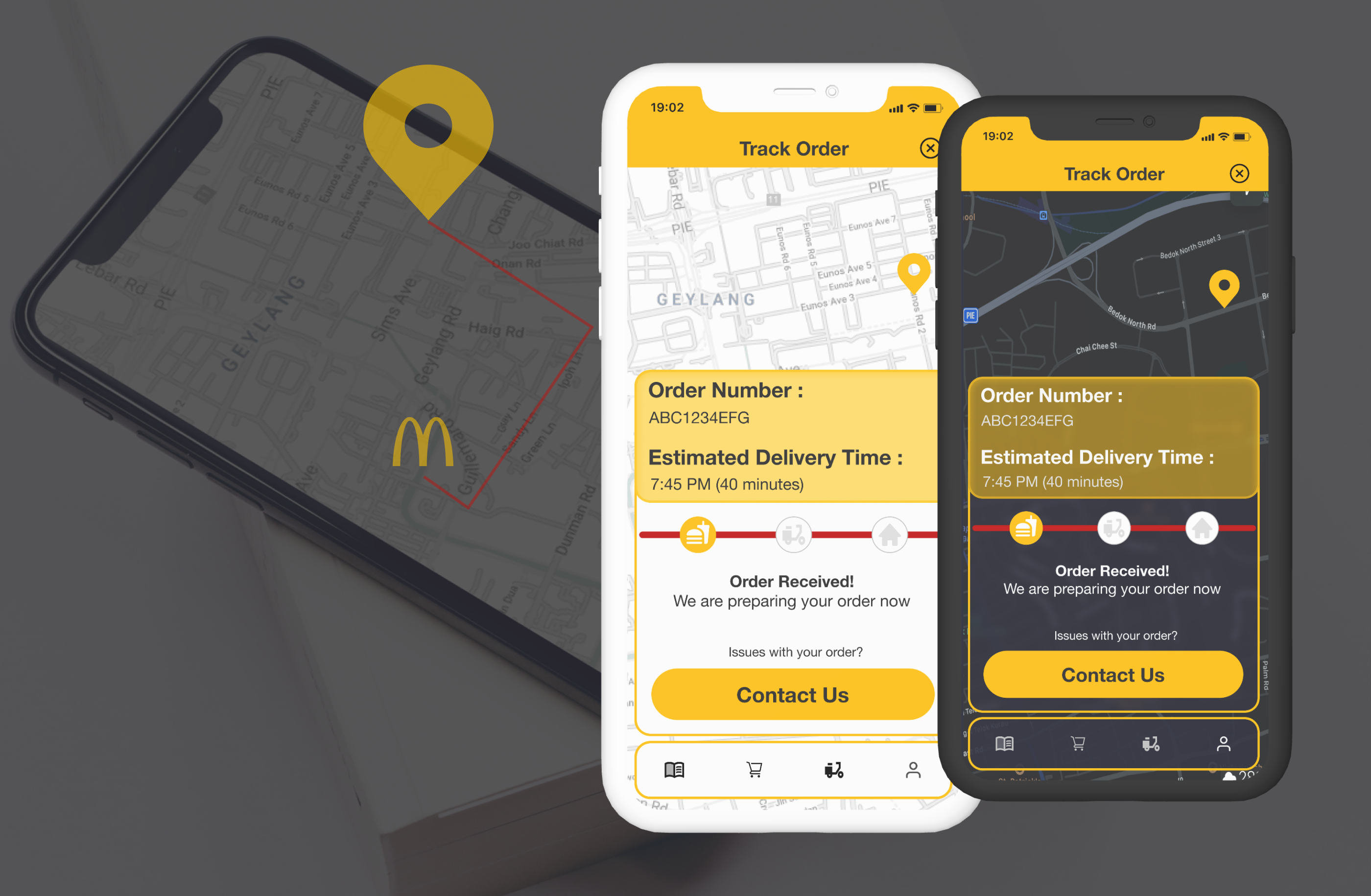
At each step of preparation, users will now be informed with the use of icons and timeline. Users will also be able to track the movement of delivery riders to further estimate the proximity of the riders. This will give users ample time to prepare for the arrival of their meal.
I thought that having a timeline is more visually engaging and easier for users to keep track of the stages of delivery. I was thinking along the lines of the heuristic evaluation of ‘recognition rather than recall’. Compared to the previous design, users are updated using only text that has no reference to previous stages. It was easy to miss out on changes. Hence, this change makes it convenient for users. A live tracking system will allow users to have a more accurate update on the whereabouts of their rider.
3. Customisation Page

Customisation of burgers now has a visual element for users.
Instead of imagining how the burger will be, users will now be able to look at the outcome of their customisation. The price for each added ingredient is also clearly displayed.
I wanted users to be able to picture the image of the burger as they are customising. Personally, I feel that makes a big difference. By having the image clearly displayed, it makes their meal look tantalising and hungry for it. Thus, it might reduce the drop-out rate for users.
4. Contact Us Page
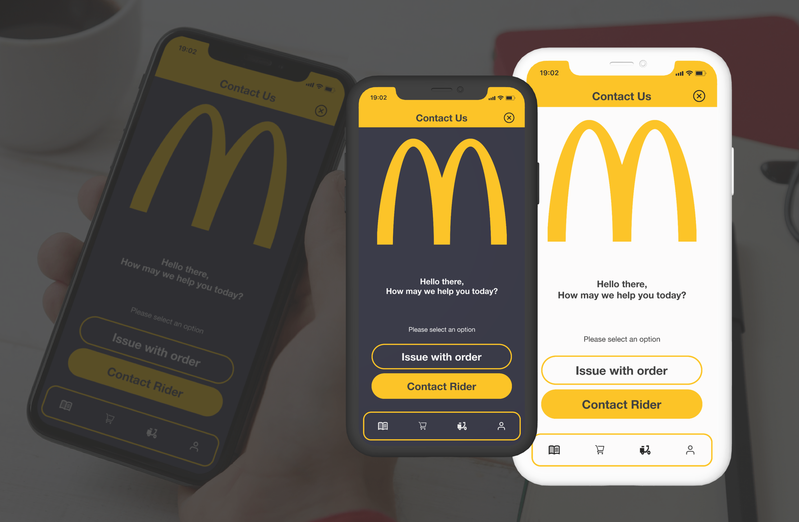
A new feature was introduced, the ‘Contact Us’ page, where users are now able to connect with both customer service team & their delivery rider in-app, should there be any problems they needed to rectify. This feature is in the chat-box style instead of the previous call-in.
While doing the comparative analysis, we realised that the major food delivery apps put a lot of thought to this feature and it was a seamless feature that allows users to get help immediately. Therefore, this was an important feature for me to introduce to the redesigned McDelivery app. I believe that should users need help with their order and are able to receive it immediately, they are more likely to forget the inconvenience caused and come back to the app for another purchase again.
Conclusion
McDonald’s, as a brand has built a strong loyal following among its customers, due to the efficiency of service and the standardisation of procedures. Throughout the years, it has grown into a cult favourite, spreading the theme of a ‘Happy & Cheerful McDonald’s Experience’.
Just as McDonald’s have been successful, their launch of the McDelivery app has been as well. However, the ‘Happy & Cheerful McDonald’s Experience’ was not as well translated through the app. Hence, there was a need to redesign and spread this message. Being able to do so would not only retain McDonald’s loyal customers, but hopefully gain new McCustomers.
Hope you have enjoyed the work above as I have enjoyed the process of redesigning the app.
Thank you for reading!
Tools: Figma
Special Mentions
I would like to thank all the instructors from the UXPM course. Your inputs and guidance was the defining factor of this UX journey. Thank you for sharing your knowledge and I have enjoyed this six months learning from the very best.
Secondly, I would like to thank my fellow course-mates, in particular Lily & Chik. Lily, for all the design inspirations and motivation. You are an excellent designer and being able to be part of your UX journey has been nothing short of inspiring. For the whole of six months, the consistent amazing work you produce has been a motivation for me to constantly learn new things and improve myself as a designer. The inspiration behind the app redesign and the patterns used was because of you and I am forever grateful for your help. I cannot wait to see you accomplish great things and I wish you the very best in everything you do.
Chik, my amazing team-mate. This was our very first project while we embark on our UX / UI journey. Thank you for pouring your heart and soul into it with me, from research to interviews & surveys, and the overall analysis of the app. Although I was tasked to do the UI alone for this capstone project, you have been along side me from the very beginning and all the way to the very end. I am grateful to have been paired with an ambitious and passionate individual, whom I can call a friend. You have been nothing but supportive and I wish you the very best in this UX / UI journey. Thank you Chik, I could not have asked for a better team-mate and friend!
